Archie Medical Triage
UX CASE STUDY · AI-POWERED HEALTHCARE TRIAGE SYSTEMCut wait times from 2 weeks to just 3–4 days, hit 80% digital adoption, and saved £385k a year across 3 practices.
CONTEXT
UK GP practices are overwhelmed: 1–2 week wait times, staff burnout, fragmented systems. The brief was to design a triage and booking platform that could reduce GP load, reroute routine cases to the right professionals, and fit into the NHS's ecosystem.
THE COMPLEXITY
Founders and clinicians wanted strict oversight, while patients wanted speed and simplicity.
EMIS integration, fragmented inboxes, and legacy NHS infrastructure limited what was possible.
Over-automation risked alienating clinicians; too little automation risked patients defaulting back to phones.
MY ROLE
Sole Designer
RESEARCH, IA, END-TO-END DESIGN- Conducted discovery with Head of Product & Strategy of 2,000 patients & 30 clinicians
- Ran system mapping workshops with the founder and GPs to define ticket flows, inbox ownership, and escalation rules
- Designed the triage interface, patient intake, and clinician dashboards
DISCOVER · RESEARCH & EXPLORE
The discovery phase involved understanding the complex healthcare ecosystem through research, stakeholder workshops, and system mapping to identify key opportunities and constraints.
- User surveys (2,000 patients)
- Clinician interviews (30 participants)
- Journey mapping workshops
- System architecture analysis
- Patient segmentation revealed distinct usage patterns
- Workflow inefficiencies across multiple touchpoints
- Technology adoption barriers in clinical settings
- Safety vs efficiency trade-offs in triage decisions
Research
- Proud of NHS
- Trusts clinicians
- Optimistic about technology in healthcare
- Somewhat flexible about consultation format
- Distrusts NHS and clinicians
- Pessimistic about technology in healthcare
- Likely to work against our solutions
Research Insights & Pain Points
Long waits, early morning calls, limited availability
Confusing process or inaccessible digital tools
Lack of visibility and follow-ups
Struggle to switch between all the different digital tools and no patient history
Many routine issues could be handled by nurses or pharmacists, but poor triage clogs GP time
Receptionists face high stress and limited support, impacting both morale and patient care
Was this a patient problem (confusing tools), a clinician problem (overload), or a systemic NHS problem (staff shortages)?
Early discovery showed it was all three — and design would need to sit at the messy intersection.
DEFINE · SYNTHESIZE & FOCUS
Synthesizing research insights to clearly articulate the problem space and define the challenge we need to solve.
- User need prioritization
- Pain point clustering
- Stakeholder alignment workshops
- System constraint mapping
- Clear problem statements
- Design principles framework
- Success criteria definition
- Technical feasibility constraints
Personas: Who are we solving for?
Seeking fast, clear access, often digitally reluctant
Seeking workload balance, safety, and reliable triage data
Overwhelmed with booking and messaging
Mapping the System with the Founder and GPs
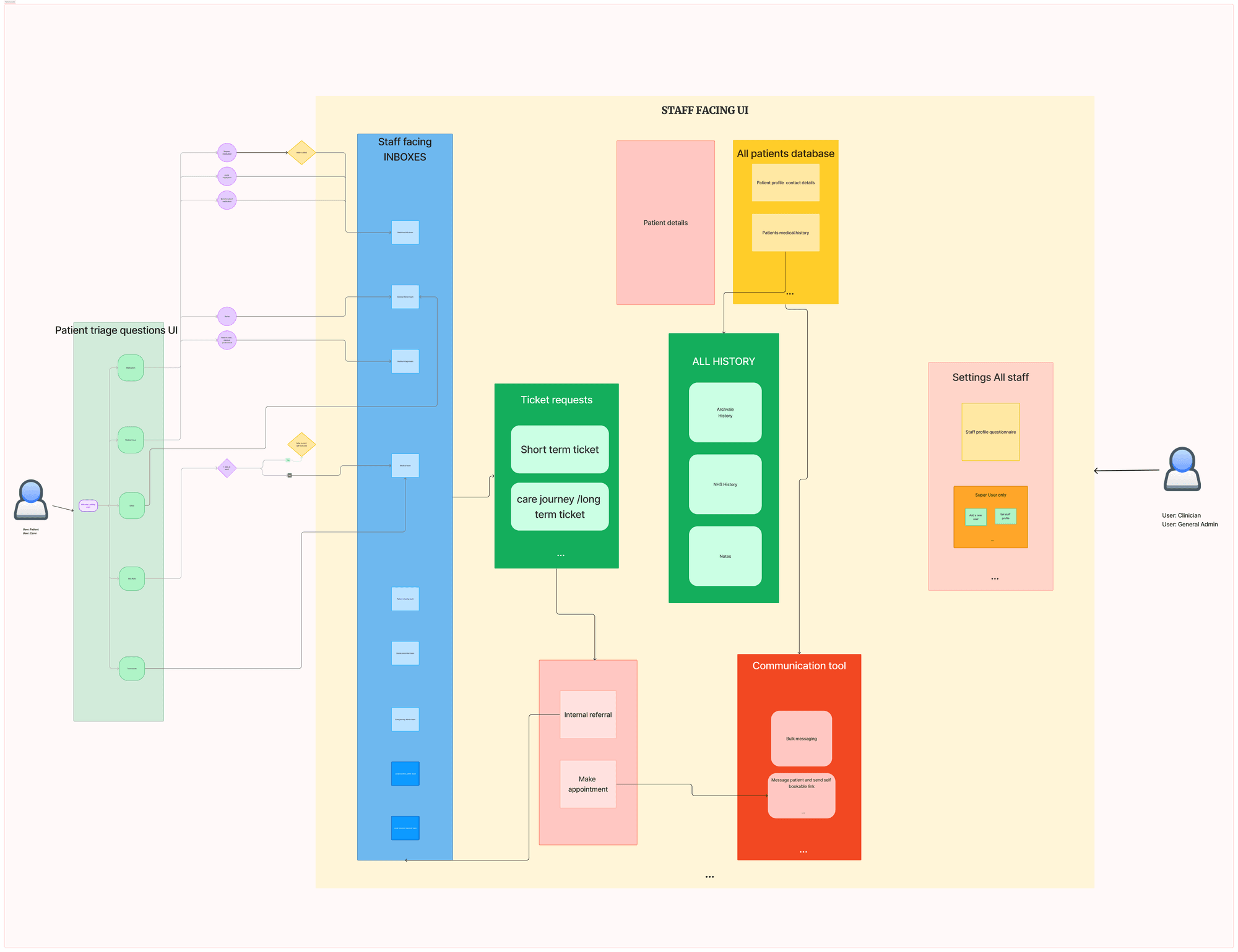
I ran a systems mapping workshop to understand how the system needed to work by understanding all the user flows and nuances of the different tasks.
- We mapped which patient "ticket" (medical, admin, prescription, test result, referral, fit note) should go to which inbox.
- We uncovered the ambiguity of ownership: should a prescription request land in Central Admin, a pharmacist queue, or the GP inbox? Each option had workload and medico-legal implications.
- We debated ticket statuses – what did "Closed" mean? Was it resolved, archived, or simply handed off? Every definition carried risk.
Complexity surfaced here: ownership, accountability, and status definitions weren't just labels, they carried medical and legal consequences.
System Workflow Architecture
Ticket Routing Matrix
MAPPING PATIENT REQUESTS TO APPROPRIATE INBOXESThrough our system design workshops, we mapped out exactly which types of patient tickets should land in which staff inbox, considering both workflow efficiency and clinical responsibility.
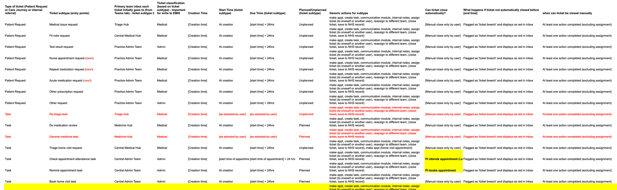
This matrix became the foundation for our routing logic, ensuring every patient request reaches the right healthcare professional while maintaining clear accountability chains.
- Medical requests require clinical oversight
- Administrative tasks can be handled by support staff
- Escalation paths maintain patient safety
- Clear ownership reduces response times
- Every request became a ticket classified as medical vs admin and mapped out which email inbox it would be routed to depending on the questions a patient answered
- Tickets had escalation rules, due times, and breach indicators
- Inbox structures mirrored actual practice workflows (Triage Hub, Central Admin, Practice Admin)
- We mapped the tickets across seven different inboxes, based on how patients responded to the questions
Design Rationale
- Simplicity and reassurance: Patients may be anxious, so the form flow must feel quick, trustworthy, and empathetic.
- Clarity: Questions should avoid medical jargon and reduce risk of incorrect input.
- Accessibility: Must support mobile-first design, low literacy levels, and inclusive UX patterns.
- Efficiency: Consultants should be able to review and route tickets quickly.
- Safety: Design must minimise risk of misclassification that could harm patients.
- Prioritisation: Interface should highlight urgency and reduce cognitive load when switching between inboxes.
- Fairness: Reduce unnecessary doctor appointments, freeing capacity for patients who need it most.
- Transparency: Build patient trust in why they are (or are not) escalated to a doctor.
- Scalability: Process should adapt as patient volumes and conditions grow.
Complexity
Patients may under-report, over-report, or misunderstand symptoms. Design must account for incomplete or misleading entries.
Automation could reduce workload by routing routine tickets straight to nurses or pharmacists. But full automation risked unsafe scenarios eg a chest pain request accidentally classified as "admin" could have dire consequences.
Patients wanted the shortest path possible: book an appointment with minimal effort. Clinicians, however, needed detailed symptom context to make triage decisions.
Clinicians complained about time lost in record-keeping, but medico-legal regulations required explicit logging in EMIS.
These trade-offs highlight that design decisions weren't about aesthetics, but about balancing safety, trust, speed, and adoption in a system where the stakes were human health.
DEVELOP · IDEATE & CREATE
Expanding the solution space through ideation, prototyping, and iterative design development.
- Brainstorming sessions
- Concept sketching
- User journey mapping
- Information architecture
- Low-fidelity wireframes
- Interactive prototypes
- Rapid user testing
- Design iteration cycles
Design Exploration in Figma
I explored numerous design variations and concepts in Figma, iterating on login flows, landing pages, and main screen designs to find the optimal user experience.
- A ticketing model for all patient and staff requests, classified into medical or admin
- Automatic rules for escalation, due times, and breach flags
- Inbox structures for different hubs (Triage Hub, Central Admin, Practice Admin)
- To replace chaotic email inboxes with structured workflows
- To make ownership explicit but flexible
- To give traceability across distributed teams
The integration layer was one of the most constrained spaces:
- We built "Save to NHS & Close" vs "Close without Saving" to give clinicians control over record-keeping.
- Designed structured entries (request type, submitter, communications, attachments).
- Trade-off: clinicians wanted fewer clicks, but governance required explicit logging. The UI had to make compliance feel seamless.
Who "owned" a breach? A GP? The system? A central team? I had to design the UI so accountability was clear without creating hostility.
DELIVER · REFINE & DEPLOY
Refining and implementing the final solution through testing, iteration, and deployment.
- High-fidelity prototypes
- User acceptance testing
- Design system documentation
- Stakeholder validation
- Developer handoff specs
- Production deployment
- Performance monitoring
- Post-launch iteration
Experience the complete end-to-end patient journey and staff workflow in the final prototype
Walkthrough the complete triage platform
PLAY PROTOTYPEOpens in Google DriveOUTCOMES · LEVEL COMPLETE
REFLECTION
This wasn't a straightforward "make it usable" project. It was:
- A negotiation of stakeholder vs user priorities (safety vs speed)
- A battle against engineering constraints (legacy EMIS, fragmented workflows)
- A careful calibration of adoption risks (alienating neither patients nor clinicians)
The value of design here was not in simplification, but in holding the complexity visibly, then shaping it into a system that patients could use, clinicians could trust, and founders could scale.